Mitch Atkins Career Power Finesse Ratio Overview

Mitch Atkins's Power Finesse Ratio was 1.147 for his 3-year Major League Baseball career. 2010 was his best season when his Power Finesse Ratio was 1.6 and his worst season was 2009 when his Power Finesse Ratio was 0. Mitch Atkins is middlin' tier compared to similar player cohorts career totals, not clearly beating or 
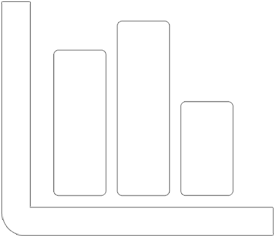
being beat by USA (1.0132499398799), Y (0.90944661486595), mlb (1.0386513759297), SP (0.94412525932619), and Millenial (1.2978994134815) player career averages. See the charts and graphs below that visualize this information in more detail.

Power finesse ratio (PFR) is a metric that estimates the number of times per inning pitched that a plate apperance ended, either negatively or positivly for the pitcher, because of the pitchers actions. It's calculated by summing walks and strikeouts over a given time period and then divided by innings pitched. Generally, for Power Finesse Ratio, higher is better. (Source)

Mitch Atkins Lifetime Power Finesse Ratio

Stats similar to Power Finesse Ratio for Mitch Atkins
Mitch Atkins
Power Finesse Ratio
Career1.147
Season Avg.0.846
162 Game Avg.1.147
More InfoSee More

Mitch Atkins Power Finesse Ratio By Year Line Chart

This line chart shows Mitch Atkins's yearly Power Finesse Ratio for each season of his Major League Baseball career. Also included, for comparison, are yearly player averages for MLB, Hall of Fame players, SP, and players from their country of birth. For these groups, averages are calculated for each group's performance for the defined year.
placeholder for chart

Mitch Atkins Power Finesse Ratio By Year Change

This waterfall chart attempts to show how Mitch Atkins's career Power Finesse Ratio changed per season. This data is cumulative for each season, each column represents the career Power Finesse Ratio Mitch Atkins had at that season in his career.
placeholder for chart

Mitch Atkins Power Finesse Ratio By Year Box Chart

This chart attempts to draw comparisons between Mitch Atkins and related player groups by summarizing Power Finesse Ratio for each season played by Mitch Atkins. The box represents the middle 50% of the data for each player with the line in the box being the median value. The whiskers represent the ranges for the top and bottom 25% of the data. Review the spread and medians to draw your conclusions!
placeholder for chart

Mitch Atkins Power Finesse Ratio Per Season Stats Table

This table shows Mitch Atkins Power Finesse Ratio stats per season for his full MLB career with the aggregations’ sum, average, minimum, maximum, and median. Also included, for comparison, are season player averages for MLB, Hall of Fame players, SP, and players from their country of birth. The comparisons are calculated for each group for each year of Mitch Atkins career.

Note: "—" indicate there were no players for comparison for a specific year. Most commonly this happens for the hall of fame group where there may not have been a hall of famer playing that year.
placeholder for chart